Better connected 2014 – 4 stars!
It was lovely to hear this week that Guildford had been awarded 4 stars in the 2014 Socitm Better connected survey. The part of the report that particularly interested me was around the experience when accessing the site via a mobile device.
This is a site that is showing great promise and is very nearly delivering all the time. The home page is almost perfect. Only ONE form of navigation makes it easy to pick out what I am looking for and it works really well. Why can’t everyone else do this? The landing pages are similarly clutter-free. Most of the time the content is very well-judged and is certainly succinct. The site excels in the experience it delivers on a mobile, where it is second to none.
Reviewer comment in Socitm Better connected 2014 report
Responsive design
It was common at the time to create secondary “mobile” websites with cut-down versions of content and a reduced set of pages. This is something that I had always disliked because you are restricting visitors based on their chosen device as well as potentially creating more work for the web team.
A responsive design allows all the site content to be available on all devices in an appropriate manner as it reacts to the size of the device being used to view the website.
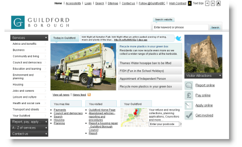
The previous version of the site loaded lots of images, CSS files and JavaScript libraries some of which were not compressed or optimised resulting in the homepage requesting over 80 files and a total download size in the region of 1.3MB. Lots of requests and a large download size make pages slow to load on some desktop computers let alone mobile devices. The image below gives an idea of the look of the site prior to this work.
 – Image source: Goss Interactive –
The responsive design was taken care of by use of what was at the time Twitter’s Bootstrap UI framework. It has since been spun off and using their words become “one of the most popular front-end frameworks and open source projects in the world”. At the time I wasn’t aware of any other local government site making active use of the framework but it has since become popular with local government web teams and suppliers.
The framework allowed a mobile-friendly site to be rapidly developed. It was also an opportunity to update the site to take advantage of “modern” CSS effects such as rounded corners where previously they would have been created using static images. Mobile devices at the time also had varying degrees of support for JavaScript so things like the expanding and collapsing menu were potentially a hazard to mobiles (more on navigation later) and were removed. The result was a plain and simple home page.

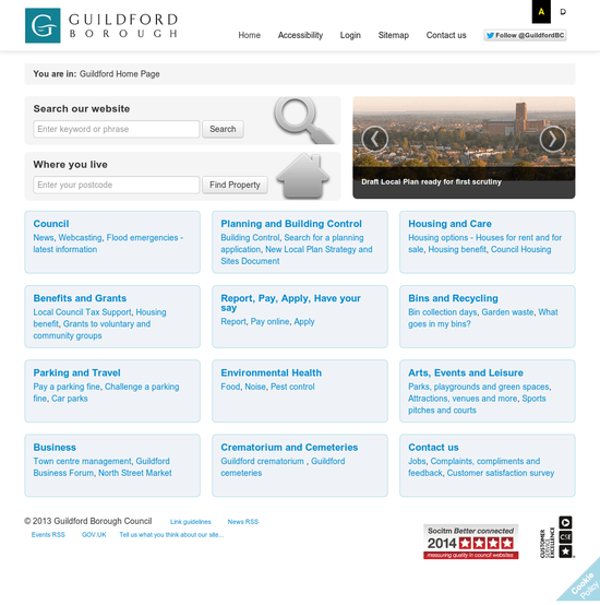
The header is quite large and is split into two areas. The top half including the logo and a set of general links, a Twitter “Follow” button and finally the accessibility controls.
The lower half, really puts the site search up-front and centre. There is also a second search box which takes people to the “Your Guildford” area where they can find property specific information (such as bin collection dates and councillor names etc.). Finally there is a carousel of the latest news articles which means whatever page the user lands on, they will have an opportunity to see news from the Communications team.
The home page and navigation pages then have a content area that is full width with clearly defined groupings of links. Content pages have a 75/25% split for the body content so lines don’t get too long to read and also leaving a column for supporting links.
The experience of reviewing @GuildfordBC site on a mobile was second to none – well done #SocitmBC
— Helen Williams (@helenewilliams) March 3, 2014
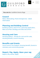
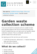
When displayed on a mobile the header is reduced in size to just the logo and accessibility links. The general links, site search and property search are relegated to a drop-down menu so the page content is the focus.


The Socitm report summarises it well:
This site excels in the experience that it delivers on a mobile, where it is second to none. Apart from the logo, the home page is text only, consisting of key headings with related topics linked underneath. It is comprehensive enough to mean that I never had to resort to search, because there was always a logical path to follow, but it wasn’t too cluttered with links either. This is a balance that most councils fail to achieve – either there are so many links (and other distractions) they take too long to scan through, or the home page for mobiles is so stripped down it is only possible to navigate to a few specific tasks.
The lack of distracting images, news stories and campaign material is very refreshing and helpful in allowing me to pursue efficiently the task in hand. I would recommend any council reviewing their content for mobiles to draw inspiration from this simple and effective mobile site experience. It is a credit to the council and to the web team!
Socitm Better connected 2014 report
Navigation
Personally I dislike A-Z navigation. To get it right relies on the web team filling the navigation with lots of synonyms to cover all bases or keeping it short and then conversely making the user do the work to find the right thing. Either way there are going to be usability issues and it was agreed to remove that method of navigation.
To counter that, the rest of the navigation has to be clear and simple together with a good site search. The expanding and collapsing menu to the left was removed as was the use of the LGNL and replaced with more user-friendly and real-world terms. This reduced the hierarchy and mean the navigation could be much simpler. It was also helped by the Web Team’s efforts to reduce the number of pages on the site and consolidate information so there also weren’t as many pages to link to.
Latterly, the site search was updated to use Google Site Search which offered a number of improvements over the search included with the CMS.
Socitm clearly approved of this work too:
In terms of the Better connected ranking, as a result of this modification, we will no longer prevent a site being a four star site because it has no A to Z. However this relaxation will only apply if both the navigation and the search are rated as very good by the reviewer. In the case of this year’s survey, one site benefits from the relaxation – Guildford BC.
Socitm Better connected 2014 report
Accessbility
We also looked to improve accessibility by offering the ability to view the site using the OpenDyslexic font which reportedly makes content easier for people suffering from dyslexia easier to read. This together with the high-contrast control gives visitors a number of options to view the site.